Visualization Element: Image Switcher
Symbol:

Category: Lamps/Switches/Bitmaps
The element displays one of three referenced images. Mouse actions change the displayed image. The images are defined in the Image settings element properties. The effects of mouse clicks are defined in the Element behavior property.
Element properties
Are all element properties available?
All properties are available only after you select the Advanced option or the All categories filter in Properties.
Element name | Example: Name assignmentAssign individual names for elements so that they are found faster in the element list. |
Element Type | Image Switcher |
Position
The position defines the location and size of the element in the visualization window. This is based on the Cartesian coordinate system. The origin is located in the upper left corner of the window. The positive horizontal X-axis runs to the right. The positive vertical Y-axis runs downwards.
X | The X-coordinate (in pixels) of the upper left corner of the element Example: |
Y | The Y-coordinate (in pixels) of the upper left corner of the element Example: |
Width | Specified in pixels Example: |
Height | Specified in pixels Example: |
Tip
You can change the values by dragging the box  symbols to other positions in the editor.
Variable
Variable | Variable ( The value of the variable changes according to user input and it is independent of the Element behavior element property. |
Image Settings
Image, if "on" | ID of a specific image from an image pool The image is used if the variable of the Variable property has the value TipYou can also select the image by using the Input Assistant. |
Image, if "off" | ID of a specific image from an image pool The image is used if the variable of the Variable property has the value TipYou can also select the image by using the Input Assistant. |
Image, if "pushed" | Requirement: The Element behavior is set to Image toggler. ID of a specific image from an image pool At runtime, the visualization displays the referenced image when the element is clicked (and the mouse button is held down). TipYou can also select the image by using the Input Assistant. |
Transparency |
|
Transparent color | Requirement: Transparency is activated. Pixels of the image which have the transparent color are displayed as transparent.
|
Scaling type | Defines how an image fits into the element frame
|
Horizontal alignment | Requirement: The Scaling type is Isotropic. Horizontal alignment of the image within the element frame or element
|
Vertical alignment | Requirement: The Scaling type is Isotropic. Vertical alignment of the image within the element frame or element
|


Element Behavior
Element behavior |
|
Tap FALSE |
Requirement: Image tapper is selected in the Element behavior property. |
Texts
Tooltip | String (without single straight quotation marks) Example: The text is output as a tooltip. If a placeholder |
Tip
Use the Ctrl + Enter shortcut to add a line break.
Tip
The specified texts are automatically transferred to the GlobalTextList text list. Therefore, these texts can be localized.
Blinking
The value in Blink interval specifies the interval in milliseconds in which the element changes between the image for the switched-on state and the image for the switched-off state.
Requirement: The visualization is run as WebVisu and the Support client animations and overlay of native elements option in the Visualization Manager is enabled. The element can blink only in this context.
For more information, see: Group: General Settings
Blink interval | Blink interval in milliseconds (ms) for the images transferred to Image Settings At 0 (default setting), the element does not blink, but the image for the switched-on state (Image, if "on" property) is displayed permanently.
| |
State variables
The variables control the element behavior dynamically.
Invisible | Variable (
Example: |
Deactivate inputs | Variable (
|
Tip
The Invisible property is supported by the "Client Animation" functionality.
Center
The properties contain fixed values for the coordinates of the point of rotation. The rotation point is displayed in the editor as the  symbol and is used as the center for rotation and scaling.
Tip
You can also change the values by dragging the symbol to another position in the editor.
X | Editable X-coordinate of the point of rotation Double-clicking in the value field will open the line editor. |
Y | Editable Y-coordinate of the point of rotation Double-clicking in the value field will open the line editor. |
Absolute movement
The properties contain IEC variables for controlling the position of the element dynamically. The reference point is the upper left corner of the element. At runtime, the entire element is moved.
Movement | ||
X |
Increasing this value at runtime moves the element to the right. | |
Y |
Increasing this value at runtime moves the element downwards. | |
Rotation | Variable (numeric data type) for the angle of rotation (in degrees) Example: The midpoint of the element rotates at the Center point. This rotation point is shown as the At runtime, the alignment of the element remains the same with respect to the coordinate system of the visualization. Increasing the value rotates the element to the right. | 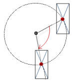 |
Scaling | Variable (integer data type) to trigger a centric stretching Example: The reference point is the Center property. The value | |
Interior rotation | Variable (numeric data type) for the angle of rotation (in degrees) Example: At runtime, the element rotates about the point of rotation specified in Center according to the value of the variable. In addition, the alignment of the element rotates according to the coordinate system of the visualization. Increasing the value in the code rotates clockwise. The rotation point is shown as the NoteIf a static angle of rotation is specified in the property, then the static angle of rotation is added to the variable angle of rotation (offset) when the visualization is executed. | 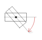 |
Tip
You can combine the variables to a Unit conversion.
Tip
The X, Y, Rotation, and Interior rotation properties are supported by the "Client Animation" functionality.
Animation
Tip
These properties are available only when you have selected the Support client animations and overlay of native elements option in the Visualization Manager.
Animation duration | Variable for the duration (in milliseconds) in which the element runs an animation
. Animatable properties
The animated movement is executed when at least one value of an animatable property has changed. The movement then executed is not jerky, but is smooth within the specified animation duration. The visualization element travels to the specified position while rotating dynamically. The transitions are smooth. |
Move to foreground | Variable (
Example: |
Input Configuration
The properties contain the configurations for the user input when using the mouse or keyboard. A user input defines an event and one or more actions that are executed when an event occurs.
TipThe Configure button opens the Input Configuration dialog. There you can create or edit user inputs. Configured user inputs are listed below the events. They each include the action that is triggered and the setting in short form. Example: Execute ST Code: | |
OnDialogClosed | Input event: The user closes the dialog. |
OnMouseClick | Input event: The user clicks the mouse button completely in the element area. The mouse button is clicked and released. |
OnMouseDown | Input event: The user clicks down on the mouse button. |
OnMouseEnter | Input event: The user drags the mouse pointer to the element. |
OnMouseLeave | Input event: The user drags the mouse pointer away from the element. |
OnMouseMove | Input event: The user moves the mouse pointer over the element area. |
OnMouseUp | . Input events:
NoteThis CODESYS-specific triggering behavior guarantees that actions for key elements are completed. A key element starts an action for OnMouseDown and ends the action for OnMouseUp. Example: A visualization user presses the mouse button within the element area of the key element and then moves the cursor position so that it is located outside of the element area. The action is ended anyway because OnMouseUp is triggered. |

Tap | When a mouse click event occurs, the variable defined in Variable is described in the application. The coding depends on the Tap FALSE and Tap on enter if captured options. |
Variable | Requirement: The Tap FALSE option is not activated. Variable (
Example: |
Tap FALSE |
|
Tap on enter if captured |
The value is |
Switch over | With the onset of a mouse click event, the variable is set; when the mouse click event is completed, the variable is reset. |
Variable | Variable ( This is when the user releases the mouse button while the mouse pointer is over the element area.If the user releases the mouse button while the mouse pointer is outside of the element area, then the mouse click event is not ended and the value is not toggled. TipThe user can cancel a started toggle input by dragging the mouse pointer out of the element area. |
Toggle on up if captured |
|
Hotkey | Shortcut on the element for triggering specific input actions When the hotkey event occurs, the input actions in the Events property are triggered. In this way, it is not the input action itself that leads to this input action, but the mouse input action. |
Key | Key pressed for input action. Example: T The following properties appear when a key is selected. |
Events |
|
Switch over |
Example: Shift+T. |
Control |
Example: Ctrl+T. |
Alt |
Example: Alt+T. |
Tip
All keyboard shortcuts and their actions that are configured in the visualization are listed on the Keyboard Configuration tab.
Permissions
Note
Available only when a user management is set up for visualization.
Access Rights button | Opens the Access Rights dialog. There you can edit the access privileges for the element. . Status messages:
|